



The Definitive Guide to Miniature Wood Finishes: Realistic Grain, Rich Stains & Beautifully Aged Paint

A miniature table can be beautifully built and still look like a craft blank. Often, the difference is not another tiny joint or a more expensive piece of timber. It is the finish: grain that follows the construction, color with a little depth, and wear placed where a real hand or shoe would leave it. Those decisions can make a simple shelf, floorboard, or painted stool feel as though it belongs in a lived-in room.
This guide to miniature wood finishes takes you from identifying your material to creating five useful looks: warm oak, deep walnut, weathered gray, translucent whitewash, and chipped paint. There are routes for actual wood and for plastic or resin that needs a convincing wood effect. You do not need to tackle every technique at once. A handful of offcuts is enough to learn which approach suits your next piece.
My preference is to build the effect gradually, keeping the underlying surface visible. You can always deepen a shadow or add another worn edge. Recovering delicate grain beneath an unnecessarily heavy layer is harder. Treat the color suggestions here as starting points, not universal recipes: different woods, paints, stains, and clear coats behave differently.
The illustrations accompanying this guide are AI-generated visual references, not photographs of tested builds. Use them to explore color, placement, and atmosphere; use your own material samples and the product instructions to judge compatibility and results.
The purchased alternatives below use Amazon affiliate links; if you buy through them, it helps fund this tiny world. As an Amazon Associate I earn from qualifying purchases.
The Rolife Farmhouse Kitchen DIY Miniature Kit offers a ready-planned room full of small cupboards and work surfaces. It is an alternative project if you would rather start with a kit than design the cabinetry yourself.

Jump to: Materials · Five finishes · Six projects · Troubleshooting
Choose the right foundation for miniature wood finishes
Real wood: basswood, balsa, and veneer
Basswood is a useful starting point for miniature furniture because its relatively quiet appearance leaves room for the finish to do the storytelling. Choose pieces with grain that suits the scale rather than assuming every strip in a packet will match. Lay neighboring floorboards together before coloring them. A conspicuously different strip can become a deliberate replacement board, but it should be a decision rather than a surprise.
Balsa is light and soft, so handle it gently around corners, shallow carving, and thin edges. Heavy sanding can remove more material than intended, and an aggressive texture tool can leave trenches instead of grain. Start with a light touch on an offcut. If the surface needs so much correction that its shape is disappearing, changing the stock may be easier than trying to rescue it with paint.
Veneer gives you real wood grain in a thin layer, but that grain has not shrunk with your furniture. Pick an area whose markings fit the piece. Sand cautiously, especially at edges, because sanding through exposes the backing or glue layer. For tiny panels, gentle hand sanding offers more control than copying a full-size power-sanding routine. Follow the veneer and adhesive instructions for mounting and finishing.
Prefer to begin with furniture rather than loose strips? The Chivertion bookcase with miniature books is a 1:12 furnishing option. Check its supplied finish and dimensions before planning any paint changes.

Plastic, resin, and already painted pieces
Plastic and resin need a painted wood effect, not the assumption that a penetrating wood stain will soak in as it does on bare timber. Clean and prepare the material according to its maker, then use a compatible primer. A cast resin kit and a freshly printed resin part are not interchangeable preparation problems; printed parts need their specified washing and curing completed before finishing. Do not sand uncured resin.
An existing painted or sealed wood surface also behaves differently from bare wood. A translucent acrylic glaze can adjust its appearance without relying on absorption. Some gel stains are approved for particular nonwood surfaces, but that does not mean every stain is suitable for every plastic. When the material or old finish is unknown, test a hidden area and keep the first approach conservative.

Make the grain believable before choosing the color
At 1:12 scale, a one-millimeter scratch represents a twelve-millimeter mark on the full-size object. That is a substantial groove in a dining table. The aim is not to carve every visible fiber. Use fine, interrupted lines, slight changes of tone, and a few stronger marks where the design needs them. At smaller scales, simplify further rather than squeezing in more lines. The table is allowed a little character; it does not need railway tracks.
Grain follows the individual piece of timber. On a framed cupboard door, the upright stiles, horizontal rails, and center panel should not share one uninterrupted pattern. On a tabletop, grain generally runs along its boards; on a turned leg, it follows the length of the original stock. A photograph of comparable furniture is often more helpful than a generic wood-texture image.
Let construction lead the wear, too. Feet meet floors, handles get touched, and projecting corners catch knocks. A protected recess is less likely to have the same bare patches as an exposed edge. I prefer a few understandable marks to an even sprinkling of distressing. You can make a well-kept antique, not only an abandoned one.

For a room with darker furniture, the iLAND Classical Bedroom Set provides a mahogany-colored reference point. That color description is not a wood-species claim; compare its size and undertone with your own pieces.

Build a small, flexible finishing kit
Start with clean offcuts from your project, a firm sanding support, sandpaper appropriate to the material, a soft brush for removing loose particles, a palette, and a small flat brush and fine detail brushes. Keep one brush for broad color and another with a reliable point for grain. A piece of clean packaging can serve as a palette, and saved strips can become a labeled sample collection rather than waste.
For purchasable options, consider a compatible primer, a modest selection of acrylic colors, acrylic glazing medium, and the clear coat recommended for your chosen paint system. Useful starting colors include a muted ochre, a medium brown, a deeper brown, a neutral gray, and an off-white. Buy individual colors around a planned effect rather than assuming a large set is necessary. A wood stain is an alternative route for bare wood, not a required addition to every kit. The supply links open Amazon searches so you can compare suitable products.
Reclaimed timber can be useful when its source and treatment are known. Avoid sanding unidentified old painted wood or chemically treated scraps. Do not use food utensils or drinking containers for finishing products. Keep protective equipment, cleaning materials, and product labels close enough that safety is part of setup rather than something remembered halfway through the job.

The CUTEBEE Serene Courtyard Book Nook Kit offers another way to enjoy timber details within a planted setting. Its enclosed composition is a separate project for anyone who likes a little garden around the woodwork.

Prepare the surface without losing the miniature
Inspect the piece under light from the side. Look for fuzz, glue smears, machining scratches, and rounded edges that should be crisp. Support slender components while sanding. Work with the grain where practical and stop when the problem is removed. There is no prize for completing every grit in a full-size woodworking schedule on a surface that was already smooth.
Choose the final abrasive according to the finish instructions. Sanding every project to an extremely fine polish can alter stain uptake, while coarse scratches can become more obvious once colored. End grain may respond differently from the broad face of a board. Include both in your sample so a table leg does not reveal an unexpectedly dark foot only after the final assembly.
Remove glue contamination before applying a penetrating stain. If you plan to finish components before assembly, preserve clean bonding surfaces and follow the adhesive requirements. Check that coatings will not interfere with fitted joints, hinges, or drawers. Several apparently thin coats can still change the fit of a very small moving part.
Control sanding dust at its source and clean it up without blowing it into the room. Suitable extraction and correctly fitted respiratory protection may be needed, especially with powered sanding. Wood dust is not harmless because the project is small. Follow the material and product safety guidance, and keep dust away from wet finishes, food, and shared living areas.

Make a sample that answers real questions
Use an offcut of the actual stock, prepared in the same way as the project. Divide it into a few zones: a lighter application, your likely choice, and a deeper version. Include a little end grain if possible. On plastic or resin, use spare material with the same primer. A color tested on white paper tells you little about its appearance over a brown base or absorbent timber.
Complete the sample through the intended clear coat. Note the products, sequence, and whether you wiped off the stain or built transparent layers. Let it reach the relevant drying stages before deciding. Compare it in the miniature room and under the lighting you expect to use. The right brown on the workbench can become too orange next to a pale wall or too dark inside a shadowy cabinet.

The cream-colored iLAND Victorian Bedroom Furniture offers a softer furnishing direction. A sample of your planned trim or floor beside finished furniture can help you judge the room’s overall warmth before committing.

Choose stain or glaze for the job
A penetrating wood stain is designed to color suitable bare wood while leaving its grain visible. Follow its instructions for stirring, application, wiping, and protective finishing. Do not treat every stain as interchangeable: a wiping stain, gel stain, dye, and reactive weathering product can have different requirements. A name such as Walnut describes a color intention, not a promise that basswood will become walnut. Browse Minwax oil-based stains on Amazon.
General Finishes recommends its compatible pre-stain conditioner to help control blotching with its water-based stains; conditioning can also affect the final color. Test it with the stain you intend to use. Do not replace it with an arbitrary coat of sealer and expect the same result. Once you reduce the wood's absorbency, you have changed the finishing process and may need a surface-coloring approach instead. Browse water-based pre-stain conditioners on Amazon. Check the brand and formulation, because these search results may include other manufacturers.
An acrylic glaze places a translucent color layer over a prepared surface. Liquitex describes glazing medium as a way to increase transparency while maintaining acrylic stability. It may also change gloss, so assess the final sheen later. Transparent and semi-transparent pigments are useful for this work. Adding an enormous amount of water to an opaque paint is not automatically equivalent to using a formulated glaze. Browse Liquitex Professional Glazing Medium on Amazon.
Mix small amounts and judge the result on your sample. The useful consistency depends on pigment strength, the medium, the base, and the effect you want. There is no dependable universal ratio. Apply successive layers only after the previous layer reaches its required dry state, and avoid repeatedly brushing paint that has started to set. For convincing grain, a controlled partial stroke often does more than another full coat.

Build a small library of wood looks
A useful color library separates the species you want to suggest from the material you are actually painting. Label a basswood sample “oak-inspired” rather than “oak,” and record the substrate alongside the color sequence. This keeps a successful visual recipe from turning into a misleading promise about a different timber. It also encourages you to notice whether the effect comes mainly from color, grain shape, or sheen.
For a pine-inspired look, keep the ground relatively pale and warm, with occasional darker growth-line suggestions. Be selective with knots: one small irregular knot may provide character, while identical dark circles across every plank look decorative rather than natural. Pale maple-inspired furniture can be quieter still, relying on close tonal changes and restrained grain rather than exaggerated streaks. At small scales, deliberately leaving some surfaces almost plain can be the convincing choice.
Cherry-inspired wood can lean toward a gentle reddish brown, but avoid assuming bright red paint produces the effect. Mahogany-inspired furniture may invite a richer warm brown and more deliberate ribbon-like variation, depending on the reference. These are broad visual directions, not species identification rules. Look at the particular age and finish you want to represent before deciding how much red, gold, or contrast belongs in the miniature.
For ebonized-looking furniture, retain a little distinction between the darkest passages and nearby highlights. A uniformly black surface can hide both grain and construction. For painted furniture, the species may be mostly invisible until an edge is worn through. In that case, spend your effort on believable exposed patches rather than fully graining areas that will never be seen. Let the visible result determine the work.

Finish one: warm, understated oak
Think of an oak-inspired finish as a warm, relatively light foundation with visible variation, not a yellow surface covered in black lines. Oak changes with species, cut, age, and finish, so choose a reference. For a cottage table, muted golden warmth may suit the scene; for a quieter contemporary shelf, keep the undertone closer to beige. Basswood painted to suggest oak will not reproduce oak's anatomy exactly, and it does not need to.
1. Prepare and sample. On bare wood, test an appropriate light oak-toned stain using its full instructions. For faux wood, apply a compatible primer and a thin, even ochre-beige base. Avoid a very bright yellow unless your reference genuinely calls for it. Let the base dry as directed before working over it.
2. Add restrained grain. Draw a little translucent warm brown along each board with a fine brush. Vary the length and pressure of the strokes, leaving some areas quiet. A few gently curving marks can suggest figure; repeated symmetrical loops on every board usually look printed. Preserve the direction of the actual furniture components.
3. Unify without flattening. If the grain feels separate from the base, test a light warm glaze over the whole board. Stop while the lighter foundation remains visible. Add a slightly darker note near a joint only when it reads as a genuine shadow rather than a thick outline.
4. Choose the finish in context. Compare matte and satin on the sample if both are compatible options. A satin surface can suit a cared-for tabletop, while a quieter sheen may fit shelves or unfinished-looking boards. Apply the selected clear coat according to its directions, checking that it does not shift the color farther toward amber than you want.

Pale furniture can give warm timber a little breathing room. The iLAND Modern White Dining Set is a purchased 1:12 option to compare with an oak-inspired floor or other warm wood details.

Finish two: walnut-inspired depth
Dark miniature furniture needs variation to stay readable. A cabinet that looks rich in daylight can become a nearly black silhouette inside a room box. Build a walnut-inspired effect with a medium brown foundation and deeper transparent passages, retaining a few lighter areas. The goal is depth, not maximum darkness. Use a reference to decide whether the overall character should lean warm, neutral, or slightly reddish. Tiny furniture deserves better than becoming a mysterious brown rectangle.
1. Establish a medium value. For bare wood, test a walnut-toned stain rather than judging the label or printed swatch alone. For a painted effect, start with a medium brown base over the appropriate primer. Keep it lighter than the deepest finish you eventually want so there is room to develop the grain.
2. Build the darker passages. Place a deeper brown glaze along selected grain paths. Let some strokes taper and break. On a drawer front, concentrate the interest where it will be visible without making every drawer identical. Keep enough of the base showing to distinguish adjacent pieces when the miniature is viewed at normal distance.
3. Recover subtle light. If necessary, add a small number of fine, lighter brown lines rather than a broad chalky drybrush. An overall pale dusting can turn polished dark wood into something that looks worn or dirty. Let the reference decide how much contrast belongs on the surface.
4. Assess the complete stack. Test the clear coat because it can alter both depth and apparent color. If the sample becomes too dark, revise the base or glaze before finishing the model. Trying to lighten a dark penetrating stain by layering pale paint over it changes the effect, which may be useful, but is not the same as reversing the stain.

If shelves are your favorite part of a miniature room, the MiniCity Library of Gods Book Nook offers a complete fantasy-library project. There is plenty of room for a fondness for books to get out of hand.

Finish three: weathered gray with wood still showing
Weathered wood is rarely one uniform gray. Protected areas may retain brown warmth while exposed grain looks paler. For a miniature fence, garden bench, or worn floor, an acrylic approach lets you control those differences. Reactive wood-aging products are a separate route: their results depend on the timber and product chemistry, so do not expect one recipe to produce identical gray on every species.
1. Start with muted gray-brown. Use a suitable stained base on bare wood or a painted base on primed material. Avoid beginning with pure black unless the reference demands very deep contrast. Establish the overall age and value before adding texture.
2. Lay in uneven gray. Brush a translucent gray layer in the grain direction, allowing some underlying warmth to remain. Vary boards slightly rather than alternating a rigid light-dark pattern. Keep recesses darker only where dirt, depth, or protection from weather makes that difference plausible.
3. Catch raised texture lightly. Load a brush with a paler gray-beige, remove most of the paint on a palette or suitable scrap, and touch the raised grain. Test the brush before it reaches the model. On a smooth surface, paint selected fine highlights instead of expecting drybrushing to invent texture that is not there.
4. Add local history. A lower edge near damp ground may look different from a sheltered underside, but moss and grime should not cover every surface equally. Keep these marks restrained. Test a compatible low-sheen clear coat if protection is needed, and check that it does not darken the pale weathering more than intended.

For another setting full of small storage details, consider the TOYQI Uncle Peter’s Warehouse Book Nook Kit. It offers a ready-designed alternative when the appeal is the whole cluttered room rather than a single handmade crate.

Finish four: translucent whitewash
Whitewash should let something beneath it remain visible. It can soften a rustic cupboard or brighten floorboards without making them look factory-painted. The underlying color matters: white over a warm brown will not look like white over a gray base. Decide whether you want a barely limed appearance or an uneven, more substantial coating before you begin.
1. Choose the route. On suitable bare wood, use a whitewash or pickling product according to its directions. Over a painted wood effect, use a compatible translucent off-white acrylic layer. Do not assume a branded wood wash and a homemade acrylic glaze have the same application or wiping instructions.
2. Apply along the grain. Work in manageable areas and keep the layer thin enough for the base to show. If your chosen product permits wiping, remove excess in the same direction. Avoid pooling around miniature joints, where a thick pale deposit can erase the construction.
3. Build selected coverage. Let the first layer reach its required dry state, then add a little more where you want stronger white. Keep some variation rather than chasing an absolutely uniform finish. If the result has become opaque, decide whether to embrace painted furniture or revise the sample instead of continuing to call it translucent whitewash.
4. Check protection carefully. Pale finishes make color changes particularly noticeable. A water-based clear coat is not a universal guarantee against yellowing or bleed-through from the wood or earlier coatings. General Finishes warns against clear coating its self-sealing white paints, so follow the specific paint system rather than adding protection automatically. Test the complete schedule before committing.

The white-and-green iLAND Victorian Furniture Set offers an alternative to painting every furnishing yourself. Compare its dimensions and colors with your room; a finished furniture set does not need distressing to belong beside handmade pieces.

Finish five: chipped paint that tells a believable story
A chipped stool or cupboard is most convincing when the exposed layer makes sense. If the piece is meant to be wooden, revealing a bright plastic corner breaks the illusion. Create the wood effect first, then decide where a colored coating would wear. Handles, projecting edges, and the lower ends of legs are useful places to study, but they do not all need damage.
1. Plan a small amount of wear. Sketch the locations mentally before painting. Leave broad quiet areas so the chips remain meaningful. At miniature scale, a few small irregular interruptions often read more naturally than large islands of missing paint on every face.
2. Choose simulated or actual chips. The simplest controlled route is to paint the colored furniture finish, then add small wood-colored marks that imitate exposed areas. Use a fine brush or a very lightly loaded piece of clean sponge, testing it first. This avoids scraping fragile balsa or exposing an unwanted substrate.
3. For actual lifting, follow the directions for your chosen chipping system. AK Heavy Chipping Effects is one option. Use the base coat, medium, topcoat, activation method, and timing specified for the exact product you buy; instructions for one chipping medium are not universal. Practice the complete sequence on a sample before applying it to furniture.
4. Work gently and stop early. Use the permitted brush or tool to disturb only the intended layer. Do not dig through the underlying wood effect or soften joints by flooding them. Let the piece dry as required, then test the manufacturer's compatible protective finish. If a chip is oversized, repaint part of it rather than adding more damage to make it look intentional.

For an optional metallic-looking knob or fitting, AMACO Rub ’n Buff Antique Gold is a separate accent product, not a wood stain. Check substrate compatibility and follow its handling and ventilation instructions.

Handle end grain and glue marks deliberately
End grain is not just another stretch of the long face. On actual wood, test its absorption separately before staining a whole batch of legs or shelf ends. Follow the selected system if it recommends different preparation for end grain. Do not flood a darkening end with more stain in the hope of evening it out. Pause while the problem is confined to the sample.
For painted faux wood, change the pattern at a visible cut end instead of carrying long parallel lines around the corner. Suggest the cut with a few short, curved or interrupted marks and close tonal variation. At smaller scales, a subtle change of direction may be enough. Large concentric rings on the end of every tiny board can be more distracting than leaving the pattern understated.
Before staining, inspect joins with light skimming across the surface. A glue smear may be nearly invisible until the surrounding wood darkens. Remove contamination using a method suitable for the wood and adhesive, without spreading it farther or hollowing out the joint. On a veneer edge, restraint matters: removing the entire face layer is a worse problem than the original mark.
If a pale glue spot appears after staining, avoid immediately sanding a wide halo around it. Assess whether a careful local correction is possible without damaging the shape. A matched glaze can sometimes disguise a small area as a surface-coloring repair, but it will not restore natural stain absorption. Test the repair on a comparable sample, and accept a painted finish when that is the cleaner rescue.

Application one: a floor with individual boards
A miniature floor benefits from variation that stays within one family. Choose your main finish, then prepare a slightly lighter and slightly deeper sample alongside it. Arrange the boards dry before attaching them so strong grain and dark pieces are not accidentally clustered. Think about board length and joint placement as well as color. The finish should support a believable floor layout, not compensate for a random one.
1. Mark the board order on an unobtrusive surface and prepare the exposed faces consistently. If coloring before installation, keep the glue surfaces appropriate for the adhesive. Apply the chosen finish without saturating thin boards unnecessarily, and follow the material guidance to limit distortion. If a water-based layer raises fibers, let it dry and use the permitted smoothing method before continuing.
2. Vary a few boards subtly. A restrained difference in glaze depth is usually enough; avoid a checkerboard of unrelated browns unless that is your reference. Keep board seams readable without filling them with thick black lines. For a worn interior, concentrate gentle wear along a credible walking route rather than applying the same pale stripe to every board.
3. Check the floor beside the walls and furniture before final protection. A room full of dark furniture may need a quieter, lighter floor to remain legible. Apply a compatible clear finish without bridging gaps you want to keep visible. Keep a labeled spare board for later repairs or an extension of the room, since matching the effect from memory is difficult.

Application two: a table worth looking at closely
A tabletop is a natural place to practice grain direction because the broad surface invites attention. Decide whether it represents a single slab, several boards, or a framed panel. Paint the grain accordingly. If you use actual wood, let its existing figure guide the design rather than forcing an unrelated pattern over it. Keep the apron and legs slightly quieter so the top remains the focal point.
1. Test the full finish on an offcut, including the clear coat. Use the oak route for a lighter everyday table or the walnut route for a deeper furniture finish. Work board by board where a joint exists, but avoid making each board look like a separate species. Maintain some tonal continuity across the top.
2. Add only the wear that suits the room. A carefully maintained dining table may have almost none; a workshop bench may have several localized marks. Avoid a pale outline around every edge as an automatic distressing step. If you include a scratch, keep its width in scale and its direction plausible for use.
3. Finish the underside and visible edges consistently with the intended object, while preserving necessary bonding areas. Check the feet and leg ends for unexpectedly dark stain uptake. When the coating has reached the appropriate handling stage, view the table from the angle a room-box viewer will see. A grain pattern that works only from directly above may need simplifying. My miniature fabrics guide helps with the table linen or nearby curtains when the woodwork is ready.

Application three: shelves that do not overwhelm the display
Shelves often work best as supporting scenery. Their finish should make the books, pottery, or groceries readable rather than competing with every object. Choose a quieter grain pattern than you would for a focal tabletop. The front edge deserves attention because it may be more visible than the upper surface once the shelf is filled.
1. Prepare the shelf faces, front edges, and visible ends together. Decide whether the boards run into a side panel or sit on brackets, and make the grain direction consistent with that construction. Keep fitting points free of unwanted coating buildup. For a pale shop shelf, try a muted oak-inspired color or a restrained whitewash over a warm base.
2. Add a small amount of front-edge variation and only enough shadow to distinguish the shelf from its backing. Do not darken every inside corner until the unit looks outlined. Test the finished shelf with a few intended display objects before committing to a final glaze. The colors should help the objects stand out, not make them appear muddy. If the display needs a few handmade bowls or jars, my miniature ceramics and pottery guide explores those details.
The CUTEBEE Owl Bookstore DIY Book Nook Kit is another ready-designed project for shelf enthusiasts. Its little bookshop makes a companion idea for anyone enjoying the display side of miniature furniture.

3. Allow the finish to reach the maker's appropriate handling or cure stage before loading it. Small objects can mark a coating that feels dry but is not ready for pressure. If you plan to attach accessories permanently, check adhesive compatibility with the finished surface instead of assuming the original wood glue will behave the same over a sealer.

Application four: a painted door with believable wear
A miniature door combines several grain directions, moving parts, and obvious places for handling wear. That makes it an excellent chipped-paint project, provided you keep the damage selective. Look at how its frame and panel are assembled before coloring it. A single wood pattern running from top to bottom across every part usually weakens the illusion.
1. Establish the underlying wood appearance where it may be exposed. Keep the vertical members, horizontal members, and center panel distinct. If the door is plastic or resin, use its compatible primer first. Test the proposed top color against the surrounding wall so the door feels part of the building rather than an unrelated painted sample.
2. Apply the colored finish and choose either painted imitation chips or a documented chipping-medium method. Concentrate a few marks near the handle and a vulnerable lower edge if those fit the story. Do not assume every door needs a broad bare strip along its bottom. A lightly used interior door may have very little wear.
3. Keep paint and clear-coat buildup away from hinge movement and close-fitting edges. Test the door's motion only when the coating can be handled safely. If the finish rubs where the door closes, correct the fit rather than treating fresh accidental damage as convincing age. Match the frame's sheen and age thoughtfully without copying every chip onto it. For a decorated panel rather than more wear, my miniature hand-painted floral patterns guide offers another direction.

Application five: a shop counter with two finish personalities
A shop counter can combine a maintained working top with a painted base. This gives you contrast without requiring two unrelated styles. A walnut-inspired countertop over an off-white or muted colored base can work well, but the best combination depends on the room. Sample the colors together before deciding that each successful individual swatch makes a successful pair.
1. Finish the top as a coherent wooden surface, following its board layout. Keep the grain visible but restrained enough for merchandise to remain the focus. For the base, establish any wood that might show through worn paint, then apply the intended colored coating. Preserve drawer clearances and assembly contact areas.
2. Put wear where customers and the shopkeeper would plausibly touch the counter. A small polished-looking area or a few edge marks can suggest use without turning the shop into a ruin. Avoid placing identical chips around every panel. If the top is meant to be well cared for, its sheen can differ slightly from the painted base.
If you would rather focus on finishing the room around ready-made cabinetry, the iLAND Luxury Kitchen Furniture Set is a 1:12 option. Check the cabinet dimensions against your floor plan before choosing it.

3. Judge the finish with a few representative objects in place, then remove them until the coating is ready for contact. Pale packaging and dark bottles reveal whether the counter is too visually busy. If it is, simplify the grain or reduce contrast rather than adding more weathering to blend everything together.

Application six: a small crate with honest roughness
A crate is a forgiving place to practice weathered gray because it can support visible board variation and a less refined surface. Rough does not mean deeply gouged. At miniature scale, light texture and uneven tone can suggest inexpensive timber without weakening thin slats. Keep the construction visible so the box reads as assembled boards rather than a solid block painted with lines.
1. Prepare the slats enough to remove unwanted fuzz and splinters while retaining the texture you intend. Use gray-brown as a starting color and vary selected boards within that family. Let obvious cut ends look different from the long faces. Avoid saturating small joints or masking them with heavy paint.
2. Add uneven gray glazing and a little pale emphasis on raised grain. Keep darker marks local to believable recesses or areas of contact. If you add lettering, place it as a separate design decision and let some wood texture remain visible. The crate does not need rust stains, moss, chips, and writing all at once to look used. Even a miniature crate can have an overenthusiastic makeover.
3. Test the protected result with the contents you plan to display. A crate of pale produce or folded fabric may need less contrast than an empty crate photographed alone. Keep handling and adhesive needs in mind when choosing whether and how to clear coat it, and follow the specific products rather than assuming weathering must always be sealed in the same way.

Let floors, trim, and furniture belong together
A miniature room becomes more convincing when neighboring finishes relate without matching perfectly. Decide which surface leads: perhaps a dark counter, a pale plank floor, or a richly finished door. Keep the surrounding wood quieter. If every surface has the strongest grain, deepest shadows, and most dramatic distressing, the room can lose a clear focal point.
Compare samples where materials meet. A weathered floor beside freshly painted skirting can be intentional, but their junction should still look physically plausible. Keep the change of finish at the actual material boundary instead of feathering one color across everything. Use a fine brush to preserve those edges, and remove accidental pooling before it hardens into a false ridge.
Repeat a subtle undertone or compatible sheen across the room to provide continuity. For example, a warm note in the floor can relate to a chair even when one is much lighter. Do not distress wall trim merely because the furniture is old. Objects can have different histories, and a careful mix of maintained and worn surfaces often tells a more interesting story.

Seal the finish, not the detail
A clear coat should suit the underlying products, the substrate, and the way the miniature will be handled. A static display cabinet and a frequently handled gaming prop have different demands. Follow the coating manufacturer's recommendations rather than choosing only by the words acrylic, polyurethane, or water-based. Those labels do not establish compatibility across every product combination.
Apply the recommended coat thickness without letting finish collect in grooves or bridge narrow gaps. Check the lower edges of shelves and the corners of panels while the product is still workable. Keep hinges, sliding surfaces, and glue areas in mind. If the chosen coating requires several layers, allow for that buildup before deciding that a drawer fit is finished.
Sheen is part of the design. Matte can suit dry weathered timber; satin can suggest maintained furniture; a deliberately polished surface may need more gloss. Avoid treating one finish as the only realistic choice. Also distinguish an artists' removable picture varnish from a furniture topcoat. Use the product for its intended purpose, not simply because both containers say varnish.

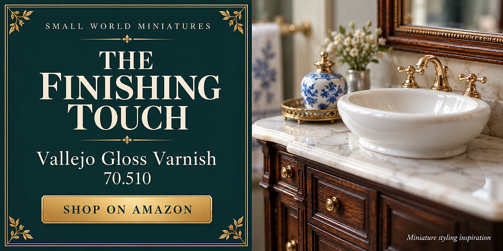
Vallejo Gloss Varnish 70.510 is one option for compatible model-paint systems when you deliberately want gloss. Test it over your exact layers and follow its directions; a glossy finish is not necessary for every miniature timber surface.
Give drying and curing the time they need
Dry to the touch, ready to recoat, and fully cured are different stages, as General Finishes explains in its drying guidance. A finish can feel dry while remaining vulnerable to pressure, packing material, or handling. Follow the specific label or technical sheet. Temperature, humidity, layer thickness, and the surface underneath can change the schedule. An overnight wait is not a dependable rule for every stain, paint, or sealer.
General Finishes documents compatible layering of some of its oil-based and water-based products after the required drying interval. That does not mean they can be mixed wet, or that every brand combination is suitable. If the intended layering is not supported, ask the manufacturer or choose a documented system. Do not rush a doubtful layer because the miniature is small.
Use finishing products with their specified ventilation and protective equipment, and keep flammable products away from ignition sources. Dust protection does not protect against solvent vapor. Oil-finish-soaked cloths and sanding waste can be a fire hazard: never leave them in a heap. Follow the label's immediate safe-storage and disposal instructions. Minwax, for example, directs its contaminated waste into a sealed, water-filled metal container for disposal under local fire regulations.

Fix the problem before adding another layer
Blotchy, too dark, or too flat
Blotchy stain: stop and inspect the cause. Glue contamination, uneven preparation, and differing absorption can all affect appearance. Another dark coat may strengthen the blotches rather than hide them. On the next sample, compare the manufacturer's compatible conditioning method or switch to a controlled painted glaze approach. On the model, a deliberate painted finish may be safer than aggressive sanding of a thin surface.
Color too dark: first judge it after the correct drying stage and in the intended lighting. Do not assume wet color is final. If the dry sample is still wrong, reduce the depth of the starting color or the number of glaze layers. A lighter overpaint can create a different attractive finish, but it does not restore untouched wood beneath a penetrating stain.
For a new room-sized project after the samples, the MiniCity Hemingway House Book Nook offers a literary-inspired setting. It is a separate build to explore when one small piece of furniture has become an interest in the whole room.

Grain too bold or repetitive: soften selected areas with a compatible translucent layer or repaint part of the base, then reintroduce fewer marks. Preserve variation in spacing, length, and strength. If the finish looks flat, add a little localized tonal variation rather than drawing dark borders around every board. Check from normal viewing distance before deciding it needs more detail.
Fuzz, lifting paint, and unwanted shine
Raised fuzz: allow the layer to dry as directed, then follow the product's permitted smoothing and recoating method. Do not sand wet color into a paste or remove the edges of the piece while chasing a perfect face. Paint lifting: stop manipulating it and investigate cleaning, primer compatibility, drying, or excessive brushing. Covering a poorly attached layer with more paint does not reliably repair its adhesion.
Unexpected gloss: glazing medium and clear coats can alter sheen. Evaluate the finished sample rather than treating an intermediate glossy layer as a failure. If a compatible lower-sheen topcoat is appropriate, test it first. A cloudy clear coat or unexpected color bleed needs diagnosis, not an automatic extra coat. Consult the product guidance before sanding or introducing another solvent.

Try a five-board practice project
Make a small display of five matching offcuts, each wide enough to compare a base, grain, and topcoat. Give one an oak-inspired finish, one walnut, one weathered gray, one whitewash, and one painted-and-chipped effect. Keep the wood or primed substrate consistent so differences come mainly from the finishing choices. Label the reverse with the products and sequence after the surfaces can be handled safely.
Set the samples beside a miniature chair, door, or wall panel. Which one keeps its detail at room-box viewing distance? Which overwhelms the furniture? Choose one approach for a simple shelf or stool before attempting a large floor. Save the other samples. They become a practical reference for future rooms, and they make it easier to repeat a finish without relying on memory.

Photograph the finish honestly
Use soft light from the side to reveal grain and surface texture without turning every brush mark into a harsh shadow. Keep the camera steady and include at least one view that shows the piece in its intended room. A close-up helps explain the technique, but the wider view tells you whether the finish works as part of the miniature rather than only as a texture study.
Check white balance against a neutral reference and avoid filters that change brown into orange or erase subtle gray. If you compare samples, photograph them together under the same light. Include a view that shows the sheen, especially when discussing matte versus satin. Let the images show the real result rather than correcting a finishing problem only in the photograph.

Choose one finish and make it yours
The most useful next step is not buying every product in this guide. Pick one small piece, identify its material, and make a sample of the complete finish. Keep the grain in scale, give the layers time, and let the object's construction guide the wear. Those habits matter more than finding a supposedly perfect brown.
Which finish would you try first: warm oak, deep walnut, weathered gray, whitewash, or chipped paint? Share your miniature and the detail you are happiest with using #smallworldminiatures. A simple shelf with a thoughtful finish is a lovely place to begin. You can find more small-scale inspiration in the online shop and get future guides through the newsletter.








Comments