



The Garden on the Dollhouse Wall: The Ultimate Guide to Miniature Hand-Painted Floral Patterns
Updated: 4 hours ago

There are two types of miniature artists in the world: the ones who see a tiny blank wall and think, “Perfect, a peaceful neutral surface,” and the ones who see that same wall and think, “What if I covered it in 487 leaves, six curling vines, and one suspiciously judgmental flower?”
I am usually the second one. I blame wallpaper. I also blame William Morris, the Arts and Crafts Movement, and the part of my brain that sees a dollhouse parlor and immediately wants it to become a botanical opera in a teacup.
This guide is a little different from the usual Small World Miniatures post. We are not walking through one specific model. We are not inventing an entire tiny town with a mayor, a scandal, and a cat who definitely knows too much. And we are not talking about a print for sale. Today, we are rolling up our sleeves and getting practical.
We are talking about miniature hand-painted floral patterns: where they came from, why they still work, how to plan them, how to paint them without turning your dollhouse wall into a leafy crime scene, and how to cheat gracefully when your hand says, “Absolutely not, Brandon, I am a wrist, not a medieval monk.”

This is a guide for miniature walls, dollhouse wallpaper, furniture, screens, fabric panels, book covers, tiny boxes, fireplace tiles, ceilings, floors, room dividers, curtains, cushions, and any other small surface that looks a little too innocent and needs a vine creeping across it.
A note before we begin: this is meant for inspiration, not exact reproduction. Your results will vary because hands vary, paint varies, brushes vary, caffeine levels vary, and some days a rose becomes a cabbage with opinions. Also, I write the blog, but many of the visuals I use on Small World Miniatures are created with AI image generation as part of the design process. Those images are wonderful for dreaming, mood, and composition, but occasionally a generated flower will grow an extra petal, a mysterious shadow, or a stem that appears to have made questionable life choices. Use the ideas. Trust your eyes. Let the tiny garden misbehave a little.
Why William Morris Belongs in a Dollhouse
William Morris was one of those people who seemed to wake up every morning and ask, “What if everything in daily life could be more beautiful?” Then, instead of stopping at the thought like a normal person with laundry to do, he designed wallpapers, textiles, books, furniture, stained glass, tiles, carpets, and enough botanical pattern to keep miniature artists delighted and mildly overwhelmed for generations.

Morris lived from 1834 to 1896 and became one of the defining figures of the Arts and Crafts Movement in Britain. The movement pushed back against the coldness and waste of industrial mass production. It valued handwork, honest materials, good design, and the belief that useful things could still be beautiful. Not “beautiful” in the fragile museum sense where you are afraid to breathe near it. Beautiful in the everyday sense: the chair you sit in, the fabric you touch, the wallpaper behind your breakfast table, the book in your hands.
For miniaturists, that idea is pure gold. A miniature room only feels alive when the surfaces have purpose. The floor, walls, upholstery, lampshades, trims, and little objects all work together. A floral print is not just decoration; it tells the viewer what kind of room they have entered. A tight leafy wallpaper can make a room feel cozy and old-world. A loose vine border can make a bedroom feel handmade and gentle. A deep green foliage pattern on a cabinet can make a tiny piece feel as though someone loved it, inherited it, moved with it three times, and keeps spare buttons in the top drawer.
Morris did not simply draw flowers floating prettily in space. His patterns are structured. They repeat. They weave. They balance natural observation with flat decorative rhythm. That is the part miniature artists can borrow beautifully. In miniature, realism often has to be edited. If you paint every vein on every leaf at 1:12 scale, your viewer may need a magnifying glass and emotional support. Morris-inspired pattern gives you permission to simplify nature into readable shapes: leaves as teardrops, petals as dots and commas, vines as flowing lines, berries as tiny punctuation marks.
That is the secret. We are not painting botanical science. We are painting botanical music.

A Tiny History of Floral Pattern, Minus the Dusty Textbook Smell
Floral pattern is ancient. People have been putting leaves, vines, blossoms, and fruit on walls, pottery, fabric, manuscripts, tiles, and furniture for a very long time. Apparently humans looked at plain surfaces and collectively decided, “No thank you, needs foliage.”

In medieval manuscripts, flowers and vines curled through borders around text. In Islamic tilework and textiles, stylized plant forms became dazzling repeat systems. In European tapestries, gardens turned into woven storytelling. In the 18th and 19th centuries, printed cottons, wallpapers, and chintzes brought floral pattern into domestic interiors in a big way.
By the Victorian era, pattern was everywhere: walls, draperies, carpets, upholstery, screens, trims, book covers. Some rooms wore more layers than a Victorian aunt preparing for a chilly carriage ride.
Morris stepped into that world with a different attitude. He admired medieval craftsmanship and the beauty of nature, but he did not want machine-made pattern that looked flashy, shallow, or overly realistic. He wanted designs that felt rooted, rhythmic, and made by thinking hands.
One of his earliest wallpaper designs, Trellis, was conceived in the early 1860s and was inspired by roses growing on a trellis at Red House, the home Morris commissioned and lived in with Jane Morris. Philip Webb, the architect of Red House and a close collaborator, contributed the birds. That detail matters because it shows what the Arts and Crafts world did so well: it blurred the line between architecture, garden, object, and art.

Later patterns such as Daisy, Fruit, Pimpernel, Acanthus, Honeysuckle, Strawberry Thief, and Willow Bough became part of the visual language many people now associate with Morris and the Arts and Crafts Movement: curling stems, layered leaves, flowers tucked into repeat systems, birds and fruit moving through the foliage, and color palettes that feel earthy rather than sugary.
For miniature artists, Morris is useful not because we need to copy his patterns line for line, but because his work teaches us how to think in repeats. A good miniature floral pattern needs rhythm. It needs scale. It needs enough detail to feel rich, but not so much that it turns into visual oatmeal.
Think of Morris-inspired design as a garden seen through a decorative filter. The flower is not a portrait of a specific flower; it is a symbol of flower-ness. The leaf is not every leaf; it is the leaf that can survive being painted forty times around a tiny room without you questioning your entire hobby.
What Makes a Floral Pattern Feel Arts and Crafts?
Not every flower pattern feels Arts and Crafts. A big pink rose with glitter on a white background may be charming, but it is probably heading toward cottage romance, shabby chic, or “grandma’s guest towel that nobody is allowed to use.” Lovely, but different.
Arts and Crafts floral patterns usually share a few design habits.

First, they love structured nature. The pattern may feel wild at first glance, but underneath it there is order. Stems curve with purpose. Leaves repeat in mirrored pairs or alternating directions. Flowers land at predictable intervals. The design has bones, even if those bones are wearing a leafy hat.
Second, they use flatness. Morris patterns do not rely on heavy shadows and illusionistic depth. They are decorative rather than photographic. In miniature, this is wonderful because flat shapes read clearly at small scale. A simple dark green leaf with a lighter center stroke often works better than a fully shaded leaf with five tones and a tiny existential crisis.
Third, they favor layered density. A Morris-inspired pattern often has a background field, a vine structure, secondary leaves, flowers, berries, and little filler marks. The eye wanders and keeps finding detail. In miniature, you can suggest that density without painting everything. A vine, two leaf shapes, one flower shape, and scattered dots can feel lush if the spacing is smart.
Fourth, they use natural but controlled color. Think moss green, olive, sage, indigo, madder red, ochre, cream, warm brown, soft blue, dusty rose, and muted gold. Not every palette has to be historically strict, but if the colors look like they could have come from plants, minerals, aged paper, and a rainy English garden, you are probably in the neighborhood.
Fifth, they treat pattern as part of the room, not a sticker slapped onto it. A floral wall can echo the upholstery. A vine on a cabinet can repeat the curve of a chair back. A ceiling border can quietly answer the rug. The room becomes a small ecosystem. A very tiny one, yes, but still. We respect the mossy kingdom.
Scale: The Tiny Tyrant
Scale is where floral patterns either sing or fall into a decorative ravine.

In 1:12 scale, one inch represents one foot. A six-inch dollhouse wall represents six feet. That means a flower painted at 1/4 inch wide would be about three inches wide in real life. A 1/2 inch flower becomes a six-inch blossom. That may work for a bold fabric or mural, but for wallpaper it can quickly look like the room has been attacked by polite cabbages.
This does not mean everything must be microscopic. It means you choose the type of pattern on purpose.
For wallpaper, keep individual flowers around 1/16 to 1/8 inch for a delicate effect, or up to 1/4 inch for a bolder Arts and Crafts statement. Leaves can be smaller, often simple dots, teardrops, or short brushstrokes.
For furniture panels, you can go slightly larger because the pattern becomes a focal area. A cabinet door, folding screen, or bed headboard can handle a 1/8 to 1/4 inch flower if the surrounding elements are calm.
For fabric, consider how the material folds. A very precise hand-painted pattern can disappear into pleats or become chaotic on soft goods. For curtains and cushions, simpler motifs often work better: one vine, a repeating sprig, a border, or a tiny scattered floral.
For tiles, the pattern can be crisp and graphic. A miniature fireplace surround with floral tiles might use repeating 1/4 inch squares, each with one stylized leaf or flower.
For ceilings and borders, go rhythmic rather than detailed. A vine border painted around the top of a wall can be made from a single wavy line, paired leaves, and dot blossoms. It reads as elaborate from a normal viewing distance, even if each flower is basically a dot wearing a crown.
Here is my favorite scale test: place the piece at the distance people will actually view it. Not with your nose pressed against it like a detective interrogating a tulip. Set it on the table. Step back. If it reads as a pattern, you are winning. If it reads as confetti after a garden party brawl, simplify.

Ten Practical Miniature Project Ideas for Floral Patterns
1. Morris-Inspired Dollhouse Wallpaper
Start with the classic: a full wall or room wrapped in a repeating floral. Choose one vine shape, one leaf shape, and one flower. Repeat them in rows or diagonals. Keep the palette muted and the background warm cream, sage, blue-gray, or deep green.
Best for: parlors, bedrooms, libraries, hallways, and any room that needs to feel like it owns a teapot with opinions.

2. Hand-Painted Furniture Panels
Paint a floral motif on a cabinet door, wardrobe panel, blanket chest, or bedside table. This is less intimidating than wallpaper because the area is smaller and mistakes can be disguised as age, wear, or “intentional charm,” the miniaturist’s most loyal friend.
Best for: Arts and Crafts interiors, bohemian rooms, Victorian bedrooms, cottage kitchens.

3. Floral Folding Screen
A folding screen is basically a tiny art gallery that stands up by itself. Paint each panel with a variation of the same vine. You can use tracing paper to repeat the design, then change the flower color on each panel.
Best for: dressing rooms, studios, bedrooms, theatrical corners.

4. Miniature Fabric Borders
Instead of painting an entire curtain, paint only the bottom edge, side edge, or tieback. A vine border gives the feeling of custom textile without requiring you to paint an entire forest on cloth.
Best for: curtains, bed skirts, cushions, table runners, lampshades.

5. Floral Fireplace Tiles
Paint tiny repeating flowers on paper, thin card, polymer clay tiles, or sealed wood squares. Arrange them around a fireplace opening. A dark green or blue tile with cream leaves looks especially good in Arts and Crafts rooms.
Best for: fireplaces, kitchen backsplashes, bathroom surrounds.

6. Patterned Book Covers and Journals
Tiny books are perfect practice surfaces. Cut small rectangles from card, paint them with a base color, then add a central flower or tiny repeating leaf. Use metallic gold or ochre for spine lines.
Best for: libraries, desks, bedside tables, shop displays.

7. Painted Stair Risers
If you want a small surprise, paint floral sprigs on stair risers. Keep them simple: one center stem, two leaves, one dot flower. Or add a bit more with vines on either side. A whole staircase of tiny florals feels handmade and magical without shouting.
Best for: cottages, garden shops, whimsical townhouses.

8. Floral Ceiling Border
Ceilings are underused in miniatures. A painted vine border around the top of a room can make the entire interior feel designed. It is also forgiving because viewers see it from below and at an angle. Finally, a use for awkward angles that does not involve muttering.
Best for: bedrooms, dining rooms, conservatories, nurseries.

9. Miniature Trays, Boxes, and Picture Frames
Paint a floral pattern on tiny trays, sewing boxes, hat boxes, or frames. These are excellent warm-up pieces before you attack a full room. They also make great story clutter.
Best for: shop counters, bedrooms, craft rooms, mantel displays.
10. Printed-and-Painted Hybrid Wallpaper
Print a faint pale version of a pattern on paper, then hand-paint selected leaves, flowers, or outlines over it. This gives you the accuracy of print with the charm of handwork. It is one of my favorite methods because it whispers, “I planned this,” even when your coffee says otherwise. Best for: large rooms, repeat-heavy walls, beginners who want confidence.

Shopping List: Supplies, Scraps, and Things Already Hiding in Your House
Before buying anything, rummage. Miniature art loves scraps. The tiny world is partly funded by old packaging, questionable drawers, and that one box labeled “miscellaneous craft stuff” that somehow contains three buttons, a dried-up glue stick, and emotional history.
I’ll include affiliate links where they are useful. Purchases through these links help support Small World Miniatures, which keeps the tiny lights on and the imaginary wallpaper committees properly caffeinated.
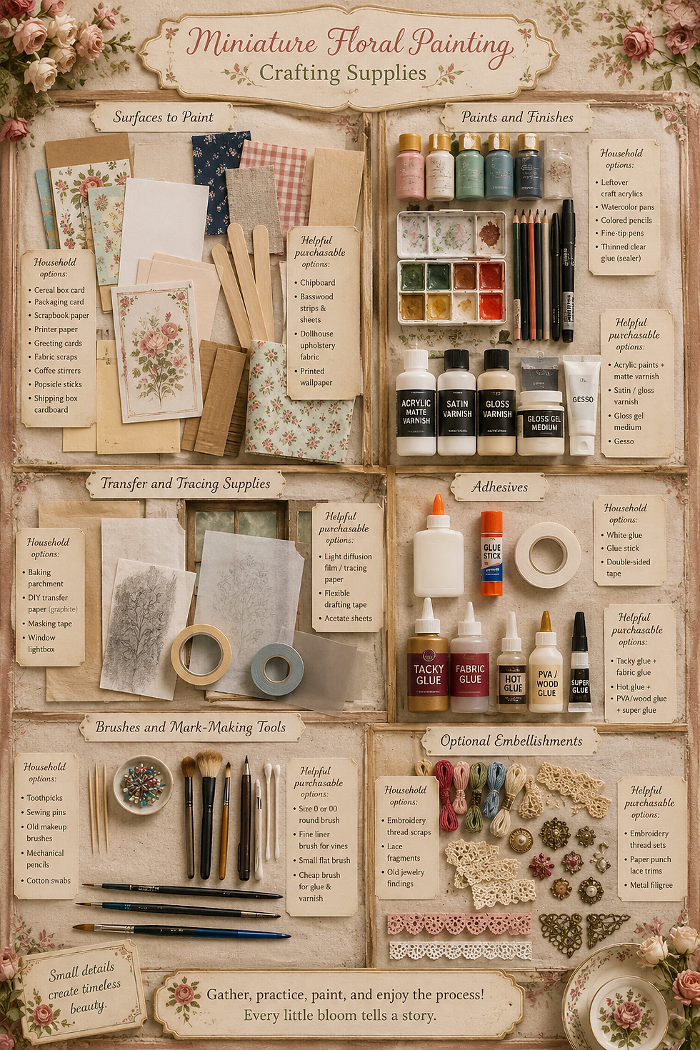
Surfaces to Paint
Household options:
Cereal box card for practice panels
Smooth packaging card for miniature wallpaper tests
Scrapbook paper offcuts
Printer paper for pattern drafts
Old greeting cards for stiffer panels
Fabric scraps from shirts, pillowcases, or quilting leftovers
Coffee stirrers or popsicle sticks for wood tests
Thin cardboard from shipping boxes for room mockups
Helpful purchasable options:
Paints and Finishes
Household options:
Leftover craft acrylics
Watercolor pans for pale washes on paper
Colored pencils for sketching stems and guide marks
Fine-tip pens for dots, veins, and outlines
Clear-drying craft glue thinned with water for sealing practice pieces
Helpful purchasable options:
Transfer and Tracing Supplies
Household options:
Baking parchment for temporary tracing
Printer paper rubbed with soft graphite on the back for DIY transfer paper
Masking tape for holding designs in place
A window used as a lightbox
Helpful purchasable options:
Adhesives
Household options:
White glue for paper-to-card tests
Glue stick for temporary mockups
Double-sided tape for removable wallpaper tests
Helpful purchasable options:
Brushes and Mark-Making Tools
Household options:
Toothpicks for dots and tiny berries
Sewing pins for the smallest dot flowers
Old makeup brushes for soft dusting or pastel aging
Mechanical pencils for faint guidelines
Cotton swabs for lifting wet paint or softening edges
Helpful purchasable options:
A good size 0 or 00 round brush
A fine liner brush for vines
A small flat brush for backgrounds
A cheap brush for glue and varnish
Optional Embellishments
Household options:
Embroidery thread scraps for stitched floral pillows
Lace fragments for borders
Old jewelry findings for decorative centers
Helpful purchasable options:

Methods and Mediums: Six Ways to Get Floral Pattern onto a Miniature Surface
Hand painting is lovely, but it is not the only path. The best miniature artists are not purists; they are problem-solvers with tiny clamps. Use the method that suits the surface, the scale, and your patience level.

Method 1: Freehand Painting
This is the classic method. You paint directly onto the wall, furniture, tile, or fabric. It has the most handmade charm and the most potential for muttering.
Best surfaces:
Sealed wood
Primed chipboard
Painted furniture
Stiff paper
Polymer clay tiles
Best tools:
Thin acrylic paint
Fine round brush
Liner brush
Toothpick for dots
Use it when:
The pattern is loose or organic
The area is small
You want visible handwork
You are comfortable correcting mistakes
Method 2: Tracing Before Painting
This is the confidence builder. You draw or print your pattern, place tracing paper over it, trace the design, then transfer it lightly to your miniature surface. After that, you paint over the guide.
Best surfaces:
Walls
Furniture panels
Screens
Tiles
Book covers
Use it when:
You want symmetry
You need repeated motifs
You are nervous about freehand layout
Your vine needs to go around a room without wandering off like it forgot its keys
Method 3: Graphite Transfer
Draw the design on paper. Rub the back of the paper with soft pencil. Tape it in place over your surface. Trace the front lines with a stylus, ballpoint pen, or dull pencil. The graphite transfers a faint version of the design.
Best surfaces:
Painted wood
Primed card
Matte paper
Gessoed panels
Use it when:
You need a simple, cheap transfer method
The surface can handle light pencil marks
You plan to paint over the lines
Tip: Keep the transfer faint. You want a whisper, not a police outline.
Method 4: Print, Cut, and Apply
Design or find a pattern, scale it down, print it, seal it, then use it as wallpaper, fabric paper, book cover, or panel insert. You can also print a pale version and paint over parts of it.
Best surfaces:
Dollhouse wallpaper
Floors
Screens
Book covers
Boxes
Cabinet inserts
Use it when:
You need a repeat across a larger area
You want crisp detail
You want to add hand-painted touches later
Important note: Be thoughtful about image rights. Many historical designs are public domain, but modern scans, recolors, product photos, and branded reproductions may not be free to use commercially. For personal projects, you have more flexibility, but for anything sold or published, use public domain sources with clear usage terms, your own drawings, or original patterns inspired by the style rather than copied line for line.
Method 5: Decoupage and Gel Medium Transfer
Print a pattern on thin paper and apply it to the surface with gloss gel medium or decoupage medium. Seal over the top. You can sand very gently once dry for an aged, embedded look.
Best surfaces:
Furniture
Boxes
Trays
Panels
Miniature signs
Use it when:
You want the pattern to look integrated into the object
You are working with curved or dimensional pieces
You plan to age the surface afterward
Method 6: Stencils and Reusable Templates
Cut a simplified floral motif from acetate, stencil film, freezer paper, or tape. Stipple paint through the stencil with a nearly dry brush or sponge. At miniature scale, stencil designs must be simple. A full Morris repeat cut as a stencil may turn you into a haunted Victorian.
Best surfaces:
Borders
Floors
Fabric
Walls
Repeated furniture details
Use it when:
The motif is bold and simple
You need repeatability
You want a slightly worn look
How to Build a Morris-Inspired Pattern from Scratch
The easiest way to become intimidated by Morris is to stare at one of his finished designs and think, “Right, I’ll just paint that at the size of a postage stamp.” That is how madness enters the craft room wearing a waistcoat.
Instead, break the pattern into parts.

Step 1: Choose the Pattern Skeleton
Most floral repeats can be simplified into one of these structures:
Straight repeat: Motifs line up in rows and columns.
Half-drop repeat: Every other row shifts halfway over, creating a more natural flow.
Diagonal vine: Stems travel diagonally across the surface.
Mirror repeat: Left and right sides reflect each other.
Border repeat: Motifs run in a line along an edge.
Scattered sprig: Small floral units repeat loosely across the surface.
For beginners, I recommend either a border repeat or a scattered sprig. For wallpaper, try a half-drop repeat because it hides small errors better than a strict grid.
Step 2: Pick Three Motifs
Limit yourself. I know, rude. But limits are what make tiny pattern possible.
Choose:
One vine or stem shape
One leaf shape
One flower or berry shape
That is enough. Truly. Morris himself used complex layering, but a miniature surface does not need to carry the entire weight of Victorian decorative history. It is very small and has never asked for this burden.
Step 3: Make a Repeat Tile
Draw a small rectangle or square on paper. For 1:12 wallpaper, try a tile about 1/2 inch wide by 1/2 inch tall. For a border, try a strip about 1/4 inch tall by 1 inch long.
Sketch your vine first. Let it enter one side and exit another so the design can continue. Add leaves. Add flowers. Add dots or tendrils only at the end.
Photocopy or trace the tile several times in a row. Does the repeat work? Does the vine connect? Is there an awkward empty gap? Does one flower look like it is trying to escape? Adjust before painting.
Step 4: Simplify for Scale
Now reduce the detail by half. Then reduce it a little more. This is not a punishment. It is how miniature pattern becomes readable.
A full-size flower might have many petals. Your miniature version might need five dots around a center dot. A large acanthus leaf may become a pointed oval with two side flicks. A twisting vine may become a single line with alternating teardrop leaves.
Step 5: Choose a Palette
A good starter Arts and Crafts palette:
Background: warm cream or muted sage
Vine: olive green
Leaves: dark green with a lighter green center mark
Flowers: dusty red, ochre, soft blue, or cream
Accent: brown, muted gold, or dark indigo
For more drama:
Background: deep blue-green
Vine: dark moss
Leaves: sage and olive
Flowers: cream and madder red
Accent: ochre dots
For a light bedroom:
Background: parchment
Vine: gray-green
Leaves: pale sage
Flowers: dusty rose
Accent: tiny brown stems
Step 6: Test at Viewing Distance
Paint one sample. Let it dry. Seal it if needed. Place it inside a room box or behind a miniature chair. Step back.
The question is not “Is every petal perfect?” The question is “Does this feel like a beautiful tiny surface?” Those are different questions. The second one is the one that matters.

The Beginner-Friendly Hand-Painting Process
This is the step-by-step section for anyone who loves the look but feels nervous about painting tiny florals by hand. Good. Nervous means you care. It also means you probably need a snack and better lighting.

Step 1: Prepare the Surface
Your surface should be smooth, clean, and sealed. Paint does not enjoy dust, oil, fuzz, or mystery residue.
For wood: sand lightly, wipe clean, apply gesso or a thin base coat.
For chipboard: seal with matte medium, gesso, or thinned acrylic so it does not drink your paint like a thirsty little goblin.
For paper: use a heavier paper if possible. Thin paper may wrinkle when painted.
For fabric: iron it first. If it is too floppy, stabilize it with spray starch, diluted fabric stiffener, or by taping it flat to a board.
Step 2: Paint the Background
Apply a thin, even base color. Two thin coats are usually better than one thick coat. Let each coat dry. Do not rush. Wet paint is where confidence goes to trip.
For Arts and Crafts color, try muted backgrounds: cream, parchment, sage, smoky blue, olive, deep green, warm gray, or dusty ochre.
Step 3: Draw the Main Vine
Use a pencil, watercolor pencil, or thinned paint. Draw the vine lightly. For wallpaper, repeat the vine at consistent intervals. For furniture, let one vine curve elegantly through the panel.
A good beginner vine is an S-curve. Not too wiggly. Not too stiff. Think “lazy garden snake who has read poetry.”
Step 4: Add Leaves as Simple Shapes
Leaves can be:
Teardrops
Ovals with pointed ends
Paired brushstrokes
Tiny hearts
Simple almond shapes
Do not outline every leaf at first. Block them in with dark green or olive. Let dry. Add a lighter center stroke later.
Step 5: Add Flowers Last
Flowers are the jewelry of the pattern. Add them after the structure is working.
Beginner flower formulas:
Five dots around one dot
One small circle with three petal strokes
A tulip shape made from three upward brush marks
A rosette made from a spiral and two dots
A berry cluster made from three tiny dots
At miniature scale, a dot can be a flower. This is emotionally freeing.
Step 6: Add Secondary Details
Only after the main pattern is dry, add small details:
Leaf veins
Dot berries
Tendrils
Tiny cream highlights
Dark centers
Short brown stem marks
Stop before you think you are done. This is annoyingly good advice. Patterns often look best when they have breathing room.
Step 7: Age or Soften the Pattern
A very fresh floral can look too loud in miniature. To soften it, apply a thin glaze over the entire surface.
Try:
10 parts water or matte medium
1 part raw umber or warm gray acrylic
Brush it over the surface quickly and lightly. Blot if needed. This unifies the colors and makes the pattern look less like it arrived five minutes ago in a plastic bag.
Step 8: Seal It
Use matte varnish for wallpaper and fabric-like surfaces. Use satin for furniture. Use gloss only for tiles, trays, lacquered boxes, or surfaces that should catch light.
Seal lightly. Too much varnish can blur delicate paint or create shiny ridges. A tiny floral wall should not look laminated unless the room belongs to a very eccentric dollhouse school cafeteria.
Tracing Before Painting: The Friendly Cheat That Is Not Cheating
Tracing has a strange reputation, as though using a guide somehow cancels out your handwork. Nonsense. Artists have used transfer methods for centuries. If it gets the design onto the surface cleanly, use it.
For miniature floral patterns, tracing is especially helpful because scale is unforgiving. A vine that drifts 1/8 inch on a full-size wall is nothing. A vine that drifts 1/8 inch in a dollhouse can look like it has lost its tiny map.

Basic Tracing Method
Draw or print your floral pattern at the correct scale.
Place tracing paper over the design.
Trace the main lines only: vines, major leaves, flower centers.
Flip the tracing paper over and rub the back of the traced lines with soft pencil.
Flip it back, position it on your surface, and tape it gently.
Trace the lines again with a dull pencil or stylus.
Lift one corner and check the transfer before removing the whole sheet.
Paint over the faint lines.
What to Trace and What to Skip
Trace:
Main vine paths
Flower centers
Large leaves
Border spacing
Repeat tile edges
Skip:
Tiny veins
Dots
Minor tendrils
Speckles
Anything that will make you resent the wallpaper personally
How to Keep It Clean
Use a light touch. Too much pressure can dent paper or wood. Too much graphite can muddy pale paint. If your transfer is too dark, dab it with a kneaded eraser before painting.
For dark backgrounds, use white transfer paper, pale colored pencil, or trace with a very thin light paint line.
Printing Patterns and Transferring Them to Miniature Walls or Objects
Printing is not the enemy of hand painting. In fact, print-and-paint hybrid work can be gorgeous. It lets you use accurate repeats while still adding the warmth of brushwork.

Option A: Print as Wallpaper
Design or source a pattern, scale it, print it on matte paper, seal it, cut it, and apply it to the wall.
Tips:
Print several scale tests.
Keep the pattern smaller than you think.
Use matte paper for walls.
Seal inkjet prints before applying wet glue or varnish.
Burnish from the center outward to avoid bubbles.
For a Morris-inspired room, print a pale vine pattern and hand-paint the flowers afterward. This gives you consistent structure with handmade charm.
Option B: Print as a Transfer Guide
Print the pattern very pale in gray, tan, or light green. Paint directly over it. This works beautifully for wallpaper and borders because the printed lines become your roadmap.
Use this when:
You need a repeat across multiple walls
You want the hand-painted look without hand-drawing every vine
You are still building confidence
Option C: Print, Cut, and Inset
Print a floral panel and glue it into a cabinet door, screen panel, tray base, or book cover. Add hand-painted highlights and seal.
This is especially good for tiny furniture because it avoids trying to paint a full repeat on a vertical object already glued into a room. I say this from experience and from the sound my back makes when I ignore my own advice.
Option D: Print on Fabric
You can print onto fabric using specialty printable fabric sheets, or by stabilizing fabric onto freezer paper or adhesive-backed sheets. Test first. Inkjet ink can bleed, and fabric texture can swallow small details.
Once printed, you can paint over selected areas with thin acrylic or fabric medium. This makes lovely cushions, curtains, bedding, or wall hangings.
Option E: Water-Slide Decals
Water-slide decal paper allows you to print a design, seal it, soak it, slide it onto the surface, and seal it again. This is useful for small objects, curved furniture panels, trays, ceramic-like surfaces, or miniature tiles.
Use gloss varnish before applying decals, then seal with matte, satin, or gloss depending on the final look. Gloss underneath helps decals settle smoothly; matte on top can make the design look painted rather than stickered.
Mediums: Paper, Wood, Fabric, Clay, and Walls
Each surface behaves differently. A pattern that looks perfect on paper may become a fuzzy swamp on fabric or bead up on glossy plastic. Test first. The test piece is not wasted time; it is future-you sending present-you a thank-you card.

Paper
Paper is easiest for wallpaper, book covers, screens, boxes, and trial patterns. Use heavier matte paper when possible. Seal printed paper before wet work. If painting directly, use thin coats and avoid overworking.
Best finish: matte varnish or satin varnish.
Wood
Wood feels rich and permanent. It is lovely for furniture panels, trays, doors, screens, and floors. Sand it smooth, seal with gesso or a base coat, then paint. If you want wood grain to show, use thin translucent color and keep the floral motif more graphic.
Best finish: satin varnish or wax-like matte finish.
Chipboard
Chipboard is affordable and useful for practice walls, folding screens, faux panels, and room inserts. It must be sealed, or the edges and surface will absorb paint unevenly. Paint both sides if warping is a concern.
Best finish: matte or satin varnish.
Fabric
Fabric is tricky because it moves, absorbs, and frays. Stabilize it before painting. Use thin paint mixed with fabric medium if the piece needs to remain flexible. For dollhouse curtains and pillows, you can often use slightly stiffer painted fabric because it helps hold scale.
Best finish: none, fabric medium, or very light matte sealer depending on use.
Polymer Clay or Air-Dry Clay
Clay is excellent for floral tiles, plaques, knobs, small boxes, and raised relief motifs. Paint after baking or drying. For tiles, use gloss finish. For old wall plaques, use satin or matte.
Best finish: gloss for tile, satin for decorative objects.
Painted Dollhouse Walls
If painting directly on walls, work before the wall is installed whenever possible. Gravity, awkward corners, and your own hand will conspire against you. If the room is already built, use a removable panel or mark a comfortable hand position before starting.
Best finish: matte varnish, applied lightly
A Complete Miniature Floral Wallpaper Workflow
Let’s walk through a full project: a Morris-inspired floral wallpaper for a 1:12 room.

Step 1: Choose the Room Mood
Before pattern, decide mood. Is this a cozy library? A green parlor? A soft bedroom? A dramatic dining room? The room decides the density and color.
For a library, choose deep green, indigo, olive, and ochre.
For a bedroom, choose parchment, sage, dusty rose, and cream.
For a dining room, choose muted red, dark green, warm brown, and aged gold.
Step 2: Measure the Walls
Measure each wall panel. Add a little extra to each side if applying paper wallpaper. Mark window and door openings. Decide whether the pattern will wrap continuously around corners or restart on each wall.
For handmade wallpaper, restarting on each wall is easier and usually fine. Only your most judgmental miniature guests will notice.
Step 3: Create a Repeat Tile
Make a repeat tile between 1/2 inch and 3/4 inch wide for 1:12 scale. Draw a diagonal vine across it. Add paired leaves and one small flower. Repeat it digitally or by photocopying to see how it fills the wall.
Step 4: Print or Transfer the Guide
Option one: print the repeat very pale directly on matte paper.
Option two: transfer the design by tracing.
Option three: draw light pencil guidelines directly on the painted wall.
For beginners, I recommend printing a pale guide. It is the least dramatic. Save drama for the tiny velvet fainting couch.
Step 5: Paint the Background
If using plain paper, paint it first. Use thin coats and let dry completely. If printing a pale guide, choose a very light background color in your design file or print over tinted paper.
Step 6: Paint the Vines
Use a thin liner brush and olive green paint thinned to a smooth consistency. Follow the guide. Keep your wrist supported. Rotate the paper rather than twisting your hand into a pretzel.
Step 7: Paint Leaves
Use a darker green for the main leaf shapes. Place leaves in alternating pairs along the vine. Let dry. Add a lighter green center stroke.
Step 8: Paint Flowers and Berries
Use dusty red, cream, ochre, or muted blue. Keep the flowers small. Dot clusters are your friends. A toothpick can make more consistent dots than a brush.
Step 9: Add Fine Details
Add tiny dark centers, tendrils, and occasional highlight dots. Do not fill every space. Pattern needs pauses.
Step 10: Glaze to Unify
Use a very thin warm gray or raw umber glaze. Test it first. Brush lightly over the finished paper to soften contrast and make it feel aged.
Step 11: Seal
Apply matte varnish or matte medium in a thin coat. If using inkjet printing, test sealer first. Some inks smear when wet, which is a very rude surprise after you have painted 300 leaves.
Step 12: Install
Use wallpaper paste, tacky glue thinned slightly, or double-sided adhesive sheets. Apply from the center outward. Use a clean card or brayer to smooth. Trim openings carefully with a sharp blade.
Step 13: Finish with Trim
Crown molding, baseboard, chair rail, or picture rail helps frame the pattern. A busy floral wallpaper often looks more polished when it has architectural boundaries.
A Beginner Floral Motif You Can Paint Today
Here is a simple motif that works on walls, furniture, and borders.

The Three-Dot Blossom Vine
You need:
Background color
Olive green paint
Dark green paint
Cream or dusty rose paint
Steps:
Paint your surface and let it dry.
Draw a soft S-curve vine.
Paint the vine with thinned olive green.
Add paired dark green teardrop leaves along the vine.
Add a lighter green stroke inside each leaf.
Use a toothpick to make three tiny flower dots at intervals.
Add one darker dot in the flower center.
Add occasional berry dots in ochre or red.
Let dry.
Seal lightly.
That is it. It sounds simple because it is simple. The magic comes from repetition. One sprig is cute. Twenty sprigs become wallpaper. Fifty sprigs become a room that looks like it has a gardener on staff, which is difficult because the gardener would be about six inches tall and demanding union snacks.
Color Recipes for Morris-Inspired Miniature Florals
These are not exact historical formulas. They are practical miniature palettes that create the right mood.

Deep Library Green
Background: dark green + a little black + a little brown
Vines: olive green
Leaves: sage green + dark green shadows
Flowers: muted red or cream
Dots: ochre
Glaze: raw umber, very thin
Use for libraries, studies, dining rooms, and dramatic parlors.
Parchment Garden
Background: warm white + tan
Vines: gray-green
Leaves: sage and olive
Flowers: dusty rose
Dots: muted brown
Glaze: warm gray, very thin
Use for bedrooms, nurseries, sewing rooms, and soft cottage interiors.
Indigo and Willow
Background: smoky blue or deep indigo
Vines: blue-green
Leaves: muted sage
Flowers: cream
Dots: pale ochre
Glaze: blue-gray, very thin
Use for bedrooms, moody parlors, or Arts and Crafts bathrooms.
Strawberry Thief-ish, Without Copying
Background: deep blue-green
Vines: dark olive
Leaves: multiple greens
Fruit dots: red and coral
Flowers: cream or pale pink
Bird substitute if you want one: one tiny simple silhouette, not a detailed bird army
Use for feature panels, folding screens, trays, and special furniture.
Golden Herbarium
Background: ochre or aged gold
Vines: brown-green
Leaves: dark olive
Flowers: cream
Accent: tiny dark brown linework
Glaze: sepia
Use for book covers, boxes, frames, and warm old-world interiors.
Brush Control Without the Panic
Tiny floral painting is mostly brush control, and brush control is mostly body control. That sounds more serious than it is. You are not training for the Olympics. You are trying to keep a leaf from becoming a pickle.

Try this setup:
Sit with both feet on the floor.
Rest your forearms on the table.
Rest your painting hand on a support block, book, or folded towel.
Keep the surface flat whenever possible.
Move the piece, not your whole body.
Breathe out as you make delicate strokes.
Use paint that flows smoothly. Thick paint makes lumpy leaves. Paint that is too watery floods the surface. For tiny pattern work, aim for a consistency somewhere between cream and ink. It should leave the brush easily but not run away unsupervised.
Load only the lower part of the bristles. Wipe excess paint on the palette. Touch the brush to scrap paper first. Then paint the miniature.
For leaves, press lightly, drag, lift. For vines, pull the brush toward you rather than pushing away. For dots, use a toothpick, pin, or the very tip of the brush.
If you make a mistake, let it dry before correcting. Wet corrections often become larger wet mistakes. Dry paint can be covered, scraped gently, or disguised with another leaf. This is how many floral patterns become lush: not from genius, from corrections wearing green.
How to Make Repeats Without Losing Your Mind
Repeats are where the pattern becomes convincing. They are also where you may begin bargaining with your own patience. Here are the easiest repeat methods.

The Dot Grid Method
Lightly mark dots where each flower center will go. Paint vines between the dots. Add leaves. This keeps spacing consistent without drawing every detail.
Best for: wallpaper, fabric, borders.
The Strip Method
Paint one narrow strip of pattern on paper. Scan or photograph it. Repeat it digitally, or trace it multiple times. This keeps your hand-painted style but avoids repainting the entire design from scratch.
Best for: wallpaper, borders, floors.
The Tile Method
Create one repeat tile. Copy it across the surface. For hand painting, transfer the tile repeatedly using tracing paper.
Best for: structured Arts and Crafts patterns.
The Border Stamp Method
Make a simple stamp from craft foam: one leaf, one flower, or one dot cluster. Stamp the main shapes, then paint vines and details by hand.
Best for: beginner wallpaper, textiles, large surfaces.
The Alternating Sprig Method
Paint a small sprig leaning left, then the next leaning right. Repeat. This makes the surface feel lively without needing a complex tile.
Best for: fabric, bedroom wallpaper, small rooms.
The trick with repeats is to decide what must be consistent and what can vary. Flower placement should be consistent. Leaf shape can vary a little. Vine thickness can vary a little. Color can vary slightly. Those small variations create hand-painted warmth.
Project Deep Dives: Three Complete Ideas
Choose a project: Folding screen · Cabinet doors · Fireplace tiles
Project One: Miniature Morris-Inspired Folding Screen
This is a great first project because each panel is small.

Materials:
Flexible tape
Thin fabric tape or paper hinges
Steps:
Cut three panels, each about 1 1/2 inches wide by 4 inches tall for 1:12 scale.
Sand edges lightly.
Prime with gesso and let dry.
Paint background in parchment, sage, or deep blue-green.
Draw one vine design that curves upward through a panel.
Trace and transfer it to each panel.
Paint vines in olive green.
Add leaves in dark green.
Add flowers in cream, muted red, or dusty rose.
Add small dots and tendrils.
Glaze lightly if needed.
Seal with satin varnish.
Hinge the panels with fabric tape or painted paper strips.
Variation: Make each panel a different season using the same vine: cream blossoms, red berries, ochre leaves.
Project Two: Hand-Painted Floral Cabinet Doors
This is perfect for upgrading unfinished dollhouse furniture.

Materials:
Steps:
Remove hardware if possible.
Sand the door panels smooth.
Prime or base coat the cabinet.
Paint the main furniture color: deep green, warm cream, muted blue, or dark wood brown.
Draw a central stem on each door panel.
Add mirrored leaves on both sides.
Paint a small flower at the top or center.
Add berry dots around the stem.
Add a thin border line around the panel.
Seal with satin varnish.
Reattach or paint hardware.
Variation: Use a printed floral inset and paint only the highlights by hand.
Project Three: Floral Fireplace Tiles
Small tiles let you practice pattern in bite-size pieces.

Materials:
Thin card, basswood, or polymer clay tiles
Ruler
Steps:
Cut tiles into 1/4 inch squares for 1:12 scale.
Paint each tile a base color: cream, blue, green, or ochre.
Paint a simple leaf or flower in the center of each tile.
Add a border dot or tiny corner mark.
Seal each tile with gloss varnish.
Glue around the fireplace opening.
Add grout lines with pale gray paint or lightweight filler.
Wipe gently so the tile faces stay clean.
Variation: Alternate floral tiles with plain tiles to reduce visual busyness.
Troubleshooting: Tiny Floral Problems and Fixes
Problem: My leaves look too big.
Fix: Switch to a smaller brush or make leaves with a single press-and-lift stroke. Reduce the number of leaves. Use dots for buds instead of full flowers.
Problem: The pattern looks messy.
Fix: Simplify the design. Remove one color. Increase spacing. Add a thin glaze to unify everything. Messy often means too many shapes are competing.
Problem: My lines are shaky.
Fix: Support your wrist and pull strokes toward you. Thin the paint slightly. Practice the vine on scrap paper ten times before touching the final surface.
Problem: The paint is bleeding on fabric.
Fix: Stabilize the fabric with starch or fabric medium. Use less water. Add a dot of fabric glue or textile medium to the paint. Test first.
Problem: The printed paper smears when sealed.
Fix: Use a spray fixative first, or apply varnish in very light coats. Let inkjet prints dry overnight before sealing.
Problem: The wallpaper bubbles when installed.
Fix: Use less glue, apply from the center outward, and burnish gently with a clean card. For large walls, use heavier paper or adhesive sheets.
Problem: The floral pattern overpowers the room.
Fix: Add plain trim, wainscoting, or a chair rail. Use the pattern on one wall only. Paint furniture in quieter colors. Not every object in the room needs to be singing soprano.
Problem: I made a mistake in the middle of the wall.
Fix: Let it dry. Cover it with a leaf, picture frame, wall sconce, curtain, mirror, or tiny shelf. Many design decisions in miniature begin as “oops” and end as “naturally, I meant to put a fern there.”
A Note on Originality, Copyright, and Being a Good Tiny Citizen
William Morris’s historic designs are old, and many original works are in the public domain. But that does not mean every image of those designs is free to use however you want. A museum scan, a modern wallpaper company’s recolor, a product photograph, or a contemporary adaptation may have its own rights or usage restrictions.
For personal miniatures, inspiration is usually straightforward: study the style, sketch your own simplified version, and enjoy your tiny room. For anything you plan to sell, publish, license, or turn into downloadable wallpaper, be more careful.
Safe approaches:
Draw your own original floral patterns inspired by Arts and Crafts principles.
Use public domain images from sources with clear download and usage terms.
Avoid copying modern commercial Morris-style wallpaper directly.
Change structure, motifs, palette, and composition enough that your pattern is truly yours.
Credit historical inspiration when appropriate.
A good rule: let Morris teach you how to see. Do not ask him to do your homework from beyond the grave. He already did plenty.
Final Thoughts: Let the Tiny Garden Grow
Miniature floral patterns can look intimidating because finished examples feel impossibly intricate. But most of them are built from very simple pieces: a line, a leaf, a dot, a petal, a repeat. That is it. The grandeur comes from rhythm.
William Morris and the Arts and Crafts Movement remind us that beauty belongs in everyday objects. That idea feels especially right in miniature. A tiny chair, a tiny wall, a tiny cabinet door, a tiny fireplace tile—these are not just props. They are chances to make a small world feel considered, loved, and alive.
Start with one vine. Add two leaves. Add a dot flower. Repeat. Suddenly you have a border. Repeat again and you have wallpaper. Add it to a cabinet and you have a story. Add it to a room and you have atmosphere.
And if the first attempt looks less like William Morris and more like a salad that got startled, congratulations. You have begun. Paint another. The garden improves with every wall.
I’d love to know which project you want to try first: wallpaper, furniture panels, fireplace tiles, fabric borders, or tiny books. Share your creations with #smallworldminiatures, and come wander the Small World Miniatures blog for more miniature design ideas, practical tutorials, and the occasional tiny object behaving suspiciously.
Until next time, keep your brush point sharp, your vines graceful, and your flowers small enough that they do not need their own postal code.
Hashtags
#smallworldminiatures #miniatures #miniatureart #dollhouseminiatures #miniatureartist #miniaturepainting #dollhouse #dollhousedecor #miniaturetutorial #handpaintedminiatures #floralpattern #williammorris #artsandcraftsstyle #morrisinspired #miniaturewallpaper #dollhousewallpaper #miniaturefurniture #miniaturefabric #tinyart #crafttutorial #miniaturedesign #artnouveauinspired #victorianminiatures #craftsmanstyle #miniaturemaker #tinyworlds #diyminiatures #miniatureflowers







Comments