



A Main Street Miniature for the World I Wanted to Live In

First Impressions in Miniature
I have always loved Disney architecture. The color, the brightness, the completely unnecessary amount of detail. A window gets a decorative frame, then a little roof, then an ornament on that roof, because apparently the window wasn't doing enough.
As a child, I remember being transfixed. I wanted to live in that world. It looked so much more magical than the one I had to go home to.
This Main Street miniature brings me right back to that feeling. Inspired by Main Street, U.S.A. at Disneyland and Disney World, it turns a row of shops into a place that seems designed entirely around the possibility of a lovely afternoon. There are cakes in the windows, flowers competing for pavement, and enough striped awnings to make the whole street look dressed for a party.
I would happily spend an unreasonable amount of time choosing a pastry here. Fortunately, the bench appears to have been installed for exactly that sort of emergency.
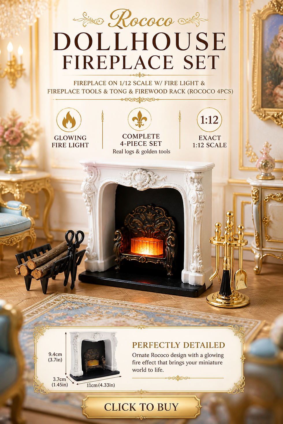
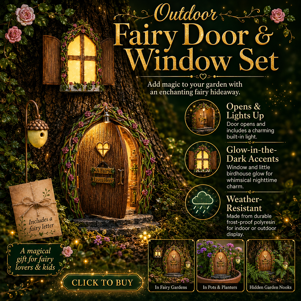
The purchased alternatives below use Amazon affiliate links; if you buy through them, it helps fund this tiny world. As an Amazon Associate I earn from qualifying purchases.

Miniature Backstory — The Tiny Tale
The annual Best Window competition has become a serious municipal problem.
The baker has arranged her cakes by height. The florist has arranged his flowers by color. Both have quietly expanded their displays toward the shared boundary, which is currently represented by a flowerpot nobody remembers buying.
The inspector arrives with the intention of making a quick decision. Unfortunately, the bakery offers refreshments, the florist insists the afternoon light will improve his display, and the café has already brought out a chair.

By closing time, the inspector is on the bench, the disputed flowerpot hasn't moved, and the award has been postponed until tomorrow. Everyone agrees that a thorough inspection is important.
That little bench is my favorite place to tuck the story. It is already there in the scene, waiting for someone with a very small job and an extremely long lunch break.

A Guided Tour of the Build
The bakery on the corner
The pink corner building claims the first look with its rounded, copper-colored dome. Below it, cream trim follows the bay windows and pink-striped awnings shade the displays. The cakes give all that decorative architecture a purpose. This isn't just a pretty facade; it offers a reason to stop.
The curved corner also softens the row. It leads the eye around the building instead of ending the street with a flat wall. That is a useful idea to borrow even if a full dome feels ambitious: a projecting bay can do a surprising amount of work.

Flowers under glass
Beside the bakery, the mint storefront has its own flourish: a curved, glass-like canopy projecting over the pavement. Above it, a circular window and ornamental trim keep the upward movement going.
Down at walking level, the flowers nearly take over. Pots cluster around the entrance and fill the transition between building and street. The scene feels cared for, but somebody has clearly stopped asking whether there is room for one more plant.
For another way to give a flower display its own architectural flourish, explore the Hector Guimard-inspired miniature vendor stand. Its canopy makes an interesting companion to this shop's airy entrance.

A change of rhythm in brick
The narrow brick facade provides a pause between the pastel shops. Its darker doorway and arched window details make the neighboring colors feel brighter. Because it is slimmer, it also interrupts the repetition of equal-sized buildings.

This is one of the details I would preserve in a simplified version. A street of equally sweet shops can blur together. A darker, narrower building gives the eye somewhere to rest before the next flourish.

Blue windows and a yellow café
The blue building has tall arched windows, a flowered balcony and a steep, gray roof with a decorative dormer. Its cream trim connects it to the rest of the street, while the roof gives it a different silhouette.
At the right, the yellow café brings the activity back down to pavement level. Its striped awning, outdoor seating and umbrella suggest that someone has already decided to stay awhile. The buildings vary in height and color, but their shared details make them feel like neighbors.

The street between the shops
The cobbled road, raised curb, black lamps and bench hold everything together. They give the facades a common setting. Warm light in the shop windows adds depth, while the darker street furniture keeps the pastel palette from floating away into pure frosting.

I especially like the balance between elaborate architecture and ordinary things. A spectacular dome is lovely. A place to sit beneath it makes the whole scene easier to imagine inhabiting.

Inspirations — From the Big World to the Small
Main Street and the pleasure of exaggeration
To me, Disney architecture feels like a fantastical version of familiar Victorian and colonial styles. The recognizable pieces are there, but the colors are brighter and the ornament keeps going. Practicality seems to have stepped out for a moment, and someone has added another finial.
The miniature leans particularly toward ornate storefronts, bay windows and steep mansard-like roofs. It borrows that theatrical approach rather than reproducing a single building or a strictly historical street.
The same playful exaggeration takes a softer turn in Minnie Mouse's Tokyo Disney cottage in miniature, with a very different roofline and a generous helping of storybook charm.

Disney describes Main Street, U.S.A. as an idealized turn-of-the-century town. Its use of progressively smaller upper floors is another interesting connection to miniature making. Proportion can be adjusted to shape how a place feels. For a home model, I would start with a consistent scale, then experiment with the roofline on paper before committing to anything more exaggerated.
World Bazaar through my camera

Looking through the photos from my latest trip to Tokyo Disney, I can see so many of the details that pull me toward this miniature. In this World Bazaar view, the arches, brickwork, pale trim and soft colors are layered together beneath the glass roof. Even the spaces above the windows have something to look at.
Tokyo Disneyland calls its entrance area World Bazaar, with Victorian-style buildings inspired by an early-twentieth-century American town. The covered setting gives it a different character from the open-air Main Streets in California and Florida, but the attraction for me is very familiar. There is always another detail waiting above eye level.
A larger world around the little street

The castle photo belongs here because it connects with that childhood feeling so directly. This is the kind of architecture that made me want to step into another world. It takes a familiar shape and makes it feel wonderfully improbable.
If you enjoy the connection between travel and tiny worlds, my visit to Small Worlds Tokyo offers another kind of miniature escape.

The canal-side view brings a different mood: warm facades, water, balconies and the repetition of windows along an edge. It is a useful reminder that inspiration doesn't have to come from an exact architectural match. I can borrow the way colors sit beside each other, or how a railing creates a foreground, without turning this little street into a copy of another place.

And then there is the entrance photo, with a very small visitor in the foreground. Apparently, even on a trip surrounded by full-sized themed architecture, I still need to bring a miniature into the picture.
Artist Tips — Make Your Own Magic
The most approachable version of this project would be a shallow row of facades on one shared street base. You can capture the color, rooflines and inviting windows without furnishing five complete buildings.
Treat the AI-generated miniature image as inspiration rather than a tested construction plan; some details may need simplifying, and your own materials will behave differently.
Supplies for a small shopping street
For the essential structure, gather clean cereal-box card, sturdy packaging board, paper, PVA craft glue, a cutting mat, metal straightedge and a sharp craft knife. Purchased illustration board is a more uniform alternative to layered packaging. Use small clamps or weights to hold flat pieces while they dry.
For the surfaces, you will need water-based acrylic paints, brushes, thin card strips and clear, clean packaging plastic for glazing. Paper can supply awnings, curtains and shop signs. Use fine sandpaper cautiously on suitable materials; remove dust before painting.
For the finishing touches, collect small scraps of wood, thin wire, paper foliage and tiny containers that can become flowerpots. Bought miniature flowers and furniture are optional shortcuts. Ready-made battery-powered miniature LEDs are optional too. Choose a complete low-voltage set with instructions, and keep its switch and battery compartment accessible.

1. Plan your Main Street miniature at one scale
A proposed scale of 1:48 keeps a row manageable: one inch represents four feet. A six-foot-eight doorway would be about one and two-thirds inches tall. Use that doorway as your reference for windows, chairs, lamps and people-sized spaces. These are planning dimensions for your interpretation, not measurements recovered from the image.
Draw each facade on paper and stand the drawings together. Vary their widths and roof heights. Start with three shops if five feels crowded. Include pavement deep enough for a bench without blocking every doorway. Check the arrangement from the low angle you want to photograph before cutting board.

2. Build a flat base and shallow shells
Laminate sturdy card for the base, spreading glue thinly and weighting it flat until fully dry. Add a separate pavement layer so the curb has a real edge. Test the position of every facade with temporary paper tabs.

Build each shop as a shallow box with a front, side returns and internal braces. Cut doors and windows before assembling the walls. Check corners against a square, then let the glue cure according to its instructions. A flat facade with folded side tabs is an easier starting point than a complete room.

3. Layer the windows and decorative trim
Make window frames from narrow card strips, working from the largest outer frame toward smaller inner details. Repeat a few shapes across the street so the buildings belong together. Paint frames separately where possible, and let them dry before fitting clear glazing behind them.
For arched windows, cut a paper template first and trace it onto each layer. Keep the arches broad enough to cut cleanly. A painted dark opening with a curtain behind it is a perfectly useful alternative where transparent glazing would reveal an empty shell.

4. Shape the roofs and the corner feature
Use scored card to test the blue shop's steep roof planes. Add overlapping paper strips for the suggestion of slates, keeping their exposed depth consistent. Build the dormer as a small separate piece, then test its fit before gluing it down.
The bakery dome is the difficult flourish. A lightweight rounded form, covered with narrow paper segments and thin ribs, can suggest it without reproducing every curve. Choose a material compatible with your glue and paint. If the dome fights you, make a faceted roof over a projecting bay instead. The corner will still have its own personality.

5. Paint the street as a connected palette
Choose a limited family of colors: soft pink, mint, blue, butter yellow and a shared warm cream. Paint test swatches beside each other before coating the buildings. A darker brick facade and gray roofs will help balance the brighter walls.
Apply thin coats and allow each to dry before adding another. Pick out trim with a smaller brush after the main wall color is dry. Keep weathering restrained: a little darker color beneath ledges and at pavement joints is enough to give depth without turning the cheerful street into an abandoned one.

6. Add awnings and the glass canopy
Paint stripes on paper while it is flat, using a lightly drawn guide so their widths stay consistent. Fold the dry paper over a simple card support. Test the slope above the window before fixing the awning in place. A plain scalloped edge is easier than a tightly gathered fabric canopy at this scale.
For the mint shop, try a gently curved piece of clear packaging supported by thin card ribs. Test the curve without forcing brittle plastic, and smooth sharp cut edges. Use an adhesive suitable for clear plastic, tested on a scrap first. A flat transparent canopy is a simpler substitute that preserves the light, airy effect.

7. Give the windows depth and light
Place a shallow shelf behind the bakery glazing and add a few simple cake shapes made from suitable craft material. Keep the display readable from outside; several clear silhouettes will work better than a crowded blur. Dark backing behind a curtain can suggest a deeper interior.
If using LEDs, test the complete set before installing it. Route wires through planned openings and keep the battery holder removable. Use opaque card partitions to prevent light leaking between shops. Follow the light manufacturer's clearance and material guidance, and never substitute mains wiring for a miniature battery set.

8. Finish the pavement and small stories
Suggest cobbles with embossed card, individually cut pieces or a purchased textured sheet. Keep the relief modest so the road doesn't look like a field of boulders. Paint a base color, let it dry, then lightly brush a second tone over the raised surfaces.
Place the bench, lamps and café furniture before fixing flowers. Leave visible routes between the doors and the street. Cluster pots at different heights around the mint shop, and echo a smaller amount of greenery elsewhere. For the Tiny Tale, the bench needs no extra prop. An optional disputed flowerpot can sit between the bakery and florist if you want to make the joke your own.

When a tiny detail misbehaves
If a wall bows, reduce the moisture in your next glue application and add internal bracing; dry new panels flat under weight before assembly. If trim disappears, increase the contrast slightly rather than making every molding thicker.

If glazing turns cloudy, test a different plastic-compatible adhesive on offcuts before replacing the affected pane. If an awning droops, add a light support underneath instead of saturating the paper with more glue.
If the flowers swallow the shop, remove a few and check the silhouette from street level. If bright LEDs flatten the scene, try a less intense compatible light set or reposition it according to its instructions. Keep ventilation and access as specified, rather than packing material around the light to hide it.
Photograph it like a place you could visit
Lower the camera toward the imaginary pedestrian's eye level. Start with a three-quarter view that lets the bakery corner lead into the row. Use a plain backdrop beyond the roofs, and leave enough distance that it doesn't become an obvious wall behind the buildings.
Soft side light will reveal trim and cobbles. Rotate the model or light to move reflections away from the shop windows. If the nearest flowers and farthest roof won't both focus, step back slightly and crop modestly, or choose the detail that matters most. Take separate close-ups of the dome, glass canopy and café seating. Those are the spots where the street's personality lives.

Closing — Until Next Time in the Small World
I think that childhood fascination is still behind a lot of what draws me to miniatures. I like places that offer more color, more detail and a little more possibility than everyday life requires.
This street has all of that. It gives the windows extra trim, the flowers extra pavement and the inspector every excuse to remain on his bench.
Which shop would you visit first? Tell me in the comments, and share your own little streets with #smallworldminiatures. If you'd like more miniature worlds in your inbox, join the newsletter using the signup form at the bottom of the page. You can also browse the online shop for a little inspiration between visits.






Comments